


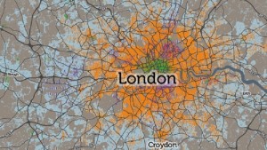

The Consumer Data Research Centre has used information gathered during the 2011 census to create an interactive map that shows how people living in the capital get to work.
As can be expected in the city, the majority uses the Tube or national rail to get around (indicated by orange on the map). However, there is a heavy concentration of bus and tram users in areas where train stations are few and far between (purple areas).
The blue areas represent people who drive to work, which is concentrated mostly on the outskirts of London. The square mile has the highest concentration of people getting to the office on foot (represented by green).
View the full map, which shows some data from around the country, HERE.