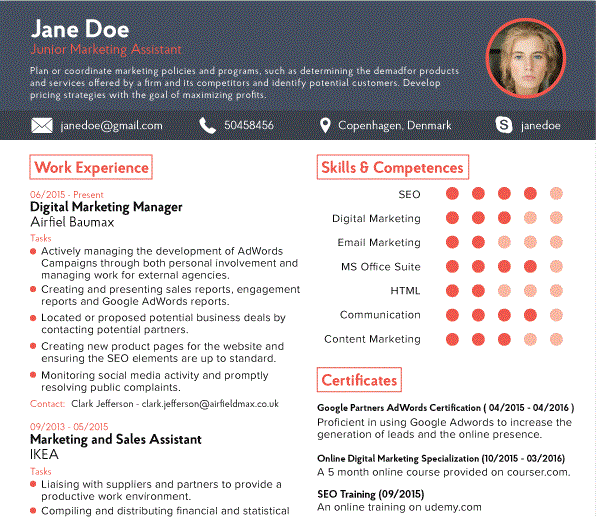
New research from HR experts has revealed the ideal CV for the digital age. Conducted by Copenhagen-based design company Novorésumé, the study hopes to turn CV building into an activity rather than another job for the to-do list as they compiled a list of the most important updates to make to your CV, and what you should avoid.
Don’t over-fill
Whenever possible, try to keep your CV to a single page, especially if you do not have more than five years of experience. It can be easy to find yourself spilling onto a second or even third page as you try to cram all your achievements in, but you risk losing the attention of your prospective employers with every added page.
Clear contact details
Have a section at the top of the CV to include contact details such as your phone number, city you live and your email address for the convenience of the reader. Keeping it at the top will ensure quick access for those wanting to make contact instead of making recruiters scan through your whole CV just to find relevant details. Including two extra social media profiles such as Twitter and LinkedIn can prove your professional persona online to employers and help prove your online proficiency.
Summarise
Focus on a professional summary that can include critical information in around two to three sentences. See your CV as your elevator pitch for a business idea, but the product you’re selling is yourself.
Work experience
Try to focus on your achievements rather than your tasks. Begin every sentence with an action verb and feature statistics and percentages wherever possible to demonstrate your ability to succeed. Instead of citing names and dates, write of how you changed things, how you saved money, or how you gained a learning experience outside of education.
Personalise
Re-write your CV for every job opportunity to make sure you squeeze the most out of your application. Carefully read the specifications of the job and try to emphasise the relevant areas.
Use graphics
Try and use icons and graphics in certain sections to highlight different areas, so long as you remain understated. Replacing a skill explanation with an icon can be confusing for recruiters, and it may be missed by algorithms on job sites, sending your CV to the bottom of the pile.
Lead with experience
Work and professional experience should tend to be at the top of your application. If you don’t have relevant experience, however, consider putting your education and skills first.
Keep it simple
Don’t try to get too glossy with the design so as to draw attention away from the importance of the content. A major part of this is to make sure that you keep the background white so that it doesn’t affect readability, especially if a recruiter prints it out in black and white. Try printing out your CV at home to see how it reads when you’re not staring at a screen.
Education
If you have a Bachelor or Master Degree, it is no longer relevant for you to include your school grades. A-Levels may still be of interest, but employers won’t need to see what you studied for GCSE. Unless relevant, you don’t need to over-fill your CV with additional information on courses taken.
What to avoid
Avoid writing anything that you wouldn’t be comfortable saying to a boss’ face. Try to avoid talks about salary and whether or not you have been previously fired. Don’t use acronyms or informal jargon; assume the reader doesn’t understand such phrases, and never enclose an unprofessional email address.
Novorésumé has prepared some example templates to help prepare people for the future of job applications, and has had templates designed by professional designers following the advice of HR experts.


