


Business cards have been a staple to every good business person for well over a century. Like anything else, they often follow trends about what’s hot and what’s not.
Gimmicky fonts, multiple colours and QR codes are among the biggest business card no-nos, according to experts.
Research also revealed leaving off contact details, filling every bit of space and pinching another company’s strapline can also ruin your chances of making a good first impression. And if you really want to impress clients, hand them a card which is a standard size, memorable for the right reasons and printed on top quality paper or card.
It also emerged, one in six believe they have lost business because they either didn’t have a card or the one they did have wasn’t impressive enough.
The stats were revealed in a study carried out by Vistaprint among 2,000 employees. The company teamed up with business creativity and innovation expert, Derek Cheshire, to help small companies make an impact with their business cards.
Cheshire said: “I have experienced a number of bizarre business cards – the first was simply someone’s contact details printed on a stretchy rubber band. Novel, but if you need two hands to stretch the rubber to read the details then how do you dial someone’s number?
“I have seen business details printed on a balloon, which was okay while inflated but not when popped and a cardboard Swiss army knife was notable but entirely useless. And finally there was a fashion for getting cards printed on plastic – again novel, and many people justified this on the basis they could be used to scrape ice from windscreens.”
The study also found four in ten would be put-off if the card featured an image of the business owner.
Similarly, 59 per cent wouldn’t view a company favourably if the handout featured misspelt words. 45 per cent said they don’t like cards which are an unusual shape.
TOP 10 TIPS FOR A PERFECT BUSINESS CARD:
1. Make it memorable AND carry it with you
2. Opt for a standard size – people don’t know what to do with a large, lumpy or expandable card
3. Use the best paper / card you can afford but don’t go over the top with embossing and cut outs
4. Get it designed using the CMYK colour system, as you won’t be disappointed with the finished product
5. If you are using colours or block images, leave bleed space
6. Have some white space, possibly on the reverse, to allow people to make notes about you
7. Put careful thought into the design and layout of the card and ensure your logo is prominent
8. Make sure all images are at least 300dpi and don’t steal images from websites
9. Proof read, and proof read again – mistakes are expensive
10. Make sure the card is congruent with you
Cheshire added: “It’s especially important for small businesses to stand out and one way to do this is to pay greater attention to details like business cards and other marketing materials is essential. There is a concept called priming, which in essence is affecting the behaviour of people by preparing them in advance with a visual image.
“Business cards can be the first instalment in a series of images or branding statements that can prime potential clients or customers. They should be memorable for the right reasons, and consistent with all other materials, stationery and website.
“As a test when designing a business card, take it out and show it to someone for five to 10 seconds before covering it up. Then ask that person what they can remember. For most, it will be nothing at all – a good business card should leave you remembering something.”
Carried out through OnePoll.com, the research also found a quarter like a business card with a unique logo.
TOP 10 BUSINESS CARD NO-NOS:
1. Don’t choose a gimmicky font – don’t use text which is too small or colours which are too hard to read
2. Non-standard size – your card needs to fit easily into a pocket or a business card holder
3. Missing contact details
4. Poor quality – don’t used flimsy card or print them out on an ink-jet printer
5. Don’t use all the colours available just because they are there
6. Don’t over-complicate or clutter the card
7. Avoid filling the card with useless information – make sure you say what you do
8. Don’t steal strapline from another company, make yours memorable
9. Don’t be afraid to use an online template to help you put your business card together – but be careful to use one which aligns with our tips and no-no’s
10. Don’t use QR codes, they’re a fad and take up too much space on a card which should be about YOU
Vistaprint have also commissioned a series of cards for classic characters.
These include business cards for Count Dracula, Victor Frankenstein, Peter Pan, Robin Hood, Sherlock Holmes and the Tooth Fairy.
-
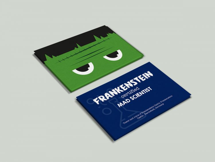
- Frankenstein business card
-
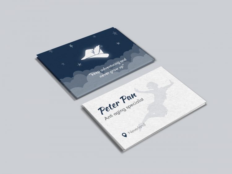
- Peter Pan business card
-
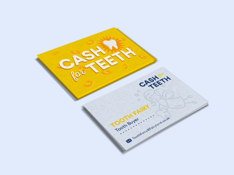
- Tooth-fairy business card
-
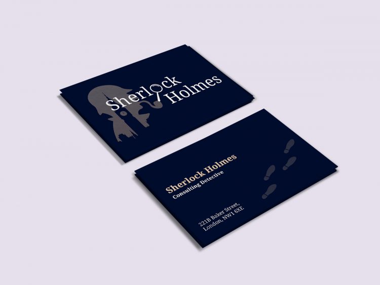
- Sherlock Holmes business card
-
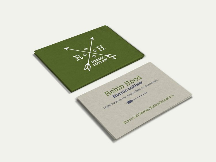
- Robin Hood business card